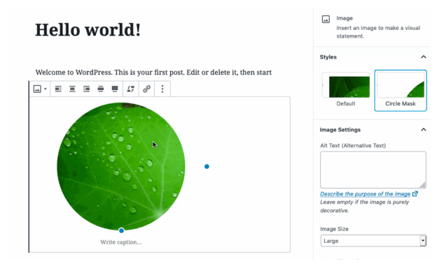
One notable change to Image block in this release is the addition of a circle mask variation. Gutenberg designer Joen Asmussen described how it works with various image aspect ratios:
This PR adds a variation to the Image block, “Circle Crop”. What that means is you can choose a style variation for the image, which rounds all 4 corners. When this is applied to a square image, that means a perfect circle. When it is applied to a rectangle, it means a pill-shape.
A new “Typewriter experience” landed in this release, providing a smoother writing flow that is especially beneficial when writing on mobile. It keeps the users’s place while typing, maintaining a margin at the bottom of the screen. This prevents typing from overflowing outside the viewport and allows the user’s eyes to stay in the same place.
This video demo from the release post explains how the Typewriter experience improves writing in the editor:
New Help Panel in the Block Inserter Offers More Real Estate for Contextual Help and Tips
After another round of usability testing in July 2019, Gutenberg designers found that most participants were not interacting with the new user help tips, preferring to jump right into editing. The floating tips also obscured essential UI and the placement of the tips was even worse on mobile.
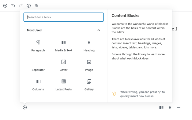
As part of an ongoing effort to bring all tips inline, Gutenberg 6.4 adds a new help panel to the block inserter, designed to provide contextual help and education for users. As the user mouses over different blocks, the panel displays the icon, title, a brief explanation of what the block does, along with space for an image preview.
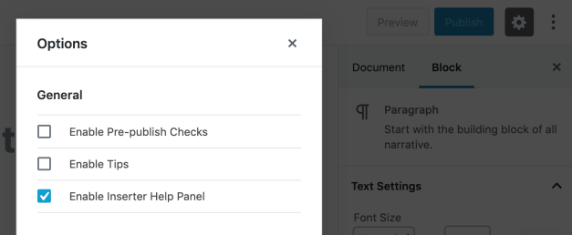
Contributors entertained quite a bit of discussion regarding how the block hovering interactions should behave, and this is likely to go through more iterations as users start testing it in the plugin. Some users may not like that it makes the block inserter take up more space on the screen, so there is a checkbox setting to turn it off under the vertical ellipses menu > Options:
The new help panel might be a good solution for helping users identify the source of a block, since branding in the block icon doesn’t always provide enough information. It could also be useful in providing a space where plugins authors could indicate if the block is only available with a paid upgrade. This would go a long way towards solving controversial issues related to monetizing plugins. Jetpack is currently beta testing a preview and upgrade nudge for blocks only available on paid plans. Using the help panel to indicate that the block is a non-functional preview might prevent users from getting frustrated by inserting the block only to discover the upsell in the editor.
In a related ticket, Matias Ventura has also floated the idea of implementing block collections, which would initially function in the same way block categories do now. This would allow developers to register a collection as another way to help users identify blocks coming from a single source.
Gutenberg 6.4 includes several new APIs and more than two dozen enhancements and bug fixes. Check out the release post for a full list of all the changes.
Original: wptavern.com


