Last month the WordPress Theme Review Team took action to curb obtrusive admin notices, requiring all themes to use the admin_notices API and follow the core design pattern. Prior to this rule going into effect, many themes would commonly display a large, branded notice upon activation. Sometimes these came with a prompt to install more plugins or instructions for getting started.
The Theme Review Team began prompting the authors of themes already known to be in violation of this guideline, to change their notices as soon as possible or risk suspension. Popular themes are rolling out updates that include cleaned-up notices.
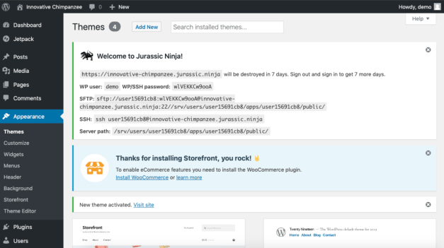
Storefront, WooCommerce’s flagship theme, was one of the themes the team cited during the meeting as an example of the notices that the team was looking to discourage with this new requirement. Its large post-activation notice took up half the screen and was previously displayed on every page. Storefront 2.5.2 replaces the notice with one that conforms to the new rule.


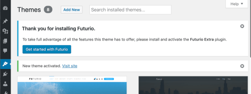
The Noto theme from Pixelgrade, which previously had nearly a full-page branded onboarding screen with a call-to-action, has updated to a smaller notice that appears in the designated area for admin notices. Futurio has also scaled back its post-installation footprint and now displays a simple, compliant message with a “Get Started” button.


Theme authors are still finding creative ways to brand their notices, but they are now much less obtrusive and confined to the expected area. They are still able to communicate the necessary information for getting started, without cluttering the admin by taking over half the screen.
Original: wptavern.com