Custom Munin Graphs
Munin graphs are often too ugly to show off on public-facing pages, and while the control panel is usually enough to get bare information from graphs, customizing these to become interactive and fancy may prove to be quite a task.
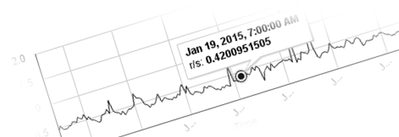
I’m going to use Google Charts to output the number of requests per second my server is processing (the data is a snapshot and does not change in this case). Fortunately, all data collected by the Munin master is stored in RRD format and can be retrieved simply by using the rrdtool fetch command, or by using the PHP RRD library if you’re using PHP, or python-rrdtool if you’re using Python.
For the sake of simplicity and a language-agnostic approach I’ll show you how to use the command line approach to retrieve datapoints from inside PHP (since this blog runs on PHP).
$data = system( 'rrdtool fetch /var/lib/munin/codeseekah.com-nginx_request-request-d.rrd AVERAGE -s -14d -r 21600' );
Don’t forget to escape any user-supplied shell arguments. So what’s going on here? -s is the start. In this case -14d says “back 14 days from the start”. -r is the resolution in seconds (12 hours in this case).
The output will look like this:
                             42

1420992000: 4.5909752676e-01
1420999200: 5.4537190845e-01
1421006400: 4.6334167590e-01
1421013600: 4.5004702842e-01
1421020800: 4.5409186047e-01
...
We can use regular expressions to get the needed data out.
preg_match_all( '#(d+):s*([0-9e+-.]+)#', $data, $matches );
$data = array();
foreach ( $matches[1] as $index => $match ) {
    $data = array( intval( $match ), floatval( $matches[2][$index] ) );
}
The code above will output an array of [time, value] items. A quick json_encode will give us a JSON payload that can be used in the chart. Check out the raw dataset. This can now be used with Google Charts.
google.load( ‘visualization’, ‘1’, { packages: [‘corechart’] } );
google.setOnLoadCallback( function() {
chart = new google.visualization.LineChart( document.getElementById( ‘chart’ ) );
var options = { /* Some chart options */
width: ‘100%’, height: 200, hAxis: { title: ‘Time’ }, vAxis: { title: ‘Requests/second’ }, lineWidth: 1, colors: [ ‘#181818’ ]
}
jQuery.get( ‘/etc/custom-munin-graphs-sample.php’, function( response ) {
var data = new google.visualization.DataTable();
data.addColumn( ‘datetime’, ‘time’ );
data.addColumn( ‘number’, ‘r/s’ );
data.addRows( response.map( function( point ) { return [ new Date( point[0] * 1000 ), point[1] ]; } ) );
chart.draw( data, options );
} );
} );
Here’s the source code:
google.load( 'visualization', '1', { packages: ['corechart'] } );
google.setOnLoadCallback( function() {
    chart = new google.visualization.LineChart( document.getElementById( 'chart' ) );
    var options = { /* Some chart options */
        width: '100%', height: 200, hAxis: { title: 'Time' }, vAxis: { title: 'Requests/second' }, lineWidth: 1, colors: [ '#181818' ]
    }
    jQuery.get( '/etc/custom-munin-graphs-sample.php', function( response ) {
        var data = new google.visualization.DataTable();
        data.addColumn( 'datetime', 'time' );
        data.addColumn( 'number', 'r/s' );
        data.addRows( response.map( function( point ) { return [ new Date( point[0] * 1000 ), point[1] ]; } ) );
        chart.draw( data, options );
    } );
} );
So, basically, an AJAX call is done to our PHP file, which would contain dynamic data pulled from the RRD files (you can add caching if you like) which Munin master writes to. The UNIX timestamps are converted into JavaScript Date objects. And that’s pretty much it.
Using d3.js can get even fancier, with interactive data-driven documents backed by Munin. How cool would that be?
